24 September 2009

H.M.S. Queen Mary, Icon of 1930's Luxury Ocean Liner Travel


There really was no other way to get over the big pond in those days. My own mother as a small child crossed the Atlantic three or four times just moving from Apalachicola to Constantinople and back, then back across again to live in Paris. Ah the glamour and excitement of it!


Wall Painting Adorning the
Bakery Cafe Onboard the H.M.S. Queen Mary
Where the Children Ate Breakfast


Compared to how we travel now...seat in upright position, tray table up, carry ons stowed, seat belt fastened (for sixteen straight hours!)... it seems incredible that as a matter of necessity when traveling to Europe you would live in a lovely stateroom, shower, nap, take long walks breathing the sea air, have sumptuous dinners, touch the stars, and arrive in England without even a whiff of jet lag! Just imagine!


The H.M.S. Queen Mary
Under Sail


We had a quick business trip to LA last week, and decided to stay on the Queen Mary for the night. She was stunning as we approached; her magnificent 18 stories filled the sky. Walking into her lobby was like walking back eighty years to the very glamourous Art Deco era of the 1930's. Did we feel like the Duke and Duchess of Windsor? Not quite, but we did feel just a touch more regal as we strolled the promenade and took our drinks on the afterdeck watching sunset's glow.


The Duke and Duchess of Windsor Strolling the
Promenade Deck of H.M.S. Queen Mary


Air Vent Aft
The H.M.S. Queen Mary


Brass Railings on the Bridge
The H.M.S. Queen Mary


Teak Railings Aft
The H.M.S. Queen Mary


The Stern of The H.M.S. Queen Mary


Speed-o-Meter on the Bridge of The H.M.S. Queen Mary


Numbered Things for Port and Starboard in the
Bridge of The H.M.S. Queen Mary


Astern The H.M.S. Queen Mary
at Night


One of Her Lifeboats Onboard The
H.M.S. Queen Mary, Never, Thankfully, Used


Brass Fittings on the Bridge of The H.M.S. Queen Mary


Another Enormous Smokestack on The H.M.S. Queen Mary


Art Deco Detailing in Hallway and Elevator of The H.M.S. Queen Mary


Silver Art Deco Banister Detail on The H.M.S. Queen Mary


Rigging for Lifeboats on The H.M.S. Queen Mary


Transatlantic Telephone Communications
Onboard The H.M.S. Queen Mary


Art Deco Fish Design Carpeting in all Staterooms
Onboard The H.M.S. Queen Mary


The Queen's Salon Onboard The H.M.S. Queen Mary


Art Deco Wall Painting Adorning the
Fireplace of the Queen's Room on The H.M.S. Queen Mary
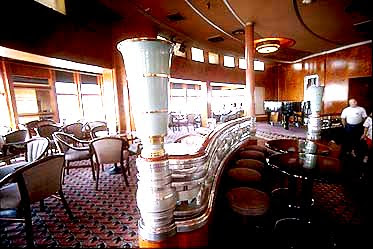


Art Deco Restaurant on The H.M.S. Queen Mary


Life Preserver on The H.M.S. Queen Mary
Also Never Used


Was she a little touristy? Yes, but just a touch. As a national treasure, she is well preserved in her original state of splendor with her dignity completely intact.

Sleeping on the Queen Mary was so quiet...no sounds of sirens or traffic or dogs barking...just the gentle sound of the rigging tapping against the masts, and in the early morning seagulls heading out to sea for an early catch. And the moon hung over the water everywhere you looked.

And I loved the craftsmanship shown in every detail: the brass fittings, the silver railings, the mahogany polished to a high sheen, the Art Deco detailing. No detail was overlooked in this tightly constructed and shipshape vessel.

Built by John Brown & Co, Ltd, Clydebank, Scotland, H.M.S. Queen Mary was launched September 26th, 1934, by H.M. Queen Mary. Gross Tonnage is 80,733 tons. Her height reaches 180 feet. Speed exceeding 30 knots. She accomodates 2136 passengers and 1101 crew. Completed on March 24, 1936, she was the first passsenger vessel to make the Atlantic crossing in under four days. During World War II, she was put into service carrying soldiers, and was later restored to her luxury liner origins. The Queen Mary is the last great Atlantic Ocean Liner left in existence.


.............................................................


Kit Golson Design

for elegant, sustainable and pragmatic

Chic Provence Interior Design


16 September 2009

Oly For All Mankind.


Until very recently Oly was a designer's best kept secret for "sexy French meets postmodern organic"; perfect for those hip and chic clients who are looking for fresh, modern and playful. What I love about their designs is that they never fail to bring a smile. The California designers Katie McIntyre and Brad Huntzinger do not do ponderously serious.


The Berkeley, California duo have taken their full range of products, from 4-inch obsidian bowls to 8 foot etageres and elaborate chandeliers, eastward to stock their newly opened flagship store in Tribeca, called Oly Atelier. Call it the democratization of design; Oly is now open to the public.

New Yorkers at least can now go sans designer to choose their Oly up close and personal. Take a look at a some of their lighthearted offerings:


{ A Sampling of Oly Designs }


Elizabeth Glass Cabinet

Meri Side Table


Jordan Entertainment Console


Margaret Bed


Vincent Half-Round Table


Babette Table


Oyster Shell Sconce


Bedroom by Oly

Bruno Table


...............................


Oly Studio and the new Oly Atelier are featured in this month's Elle Decor special 20th Anniversary issue.

If you are not going to be in NYC any time soon, and would like to have some of Oly's delightful things in your home, talk to your designer. Oly Studio works with the trade only (except for this new flagship store).


..........................................


in 2010, it's:


Kit Golson Design

for elegant, sustainable and pragmatic

Chic Provence Interior Design


09 September 2009

A Recessionista Redecorates: Before & After's of a Silicon Valley Living Room


The clients had inhabited a Restoration Hardware meets Anthropologie living room for quite a few years. The colors were calming and restorative (blue, cream, brown and silver), and that worked for the frantic pace of Silicon Valley in the early 2000's, when we all needed sanctuary from the frightful rigors of the rise of e-commerce.

But that was before the Downturn of 2009; now there is a distinct need for energy, zing, cheer, a bit of glamour, some fun and comfort. Enter the interior designer on a mission!

.......................................

Let's take a peek at the { AFTER } pictures first:


The clients wanted to keep two non-negotiables: the colorful and graphic Turkish rug that had been in the dining room, and the whimsical chandelier sitting now in the left rear corner. Since the rug brings lots of energy, color and pattern, it was perfect. The chandelier, with its bounty of treasures of the sea---coral, pearls, silver, mercury glass---becomes the room's folly, injecting a bit of fun and cheer.


An unequivocally warm and sunny yellow was chosen for below and a warm cream above the dado. The dado itself is stenciled with a favorite motif, coral, in a favorite color, coral.


The Picasso print from the thrift store, brought in for its calm nature and happy palette, looks perfectly happy leaning against the wall with that large coral piece for company.


The room was transformed by the curvy, nod-to-Louis XIV mantel, and by the nod-to-Empire style mirror above. The mantel and mirror were salvage finds, now painted and applied with a gold leaf finish. Stunning!


View of the living room entering from the dining room shows how all the elements fit together. The citron draperies, the coral sofa, the yellow walls, the jade green of the carpet all form a sophisticated, citrus-y palette that draws you in and ties the room to the outdoors just beyond. Peeking in from the left side is the citron media cabinet. The cabinet is a dresser found at Afterwards, a favorite resale shop in Menlo Park, California. With its modern lines, lucite knobs and citron color, it was the perfect candidate for repurposing as a media cabinet.


Is there anything fresher or more cheering than a
bowl of lemons on a white mantel?


The dahlia is a motif also beloved and repeated in all the cushions, tying the varied seating pieces together visually. The mohair was chosen because it is green and sustainable; it repels stains and it's naturally fire-resistant, and certainly for it's undeniable glamour factor.


A stencil of coral was found in a book and repeated around the circumference of the living room. It is subtle but adds grace and charm to the walls. The yellow below defines and warms the space of the living room, which is open to the kitchen and dining rooms. It repeats a theme found in the chandelier of treasures from the sea.

..........................................


Now for the { BEFORE } pictures, below:


A Plain Jane flush mantel was too depressing.


A sweet, clutter-y space without a shred of glamour! The before living room had too much going on, and an awkward floor plan. The chilly blue-green wall color did not awaken the spirit.


Some of the elements..the Chinese cachepots on the table...made it into the redesign, but others were moved to different rooms, sold on Craigslist, or given to a grown daughter for her apartment.

....................................................

We created an energetic, cheerful and room with a bit of glamour!

Resources:

Paint:
Benjamin Moore Frittata
Benjamin Moore Linen White
Custom blends

Fabric:
Mohair sofa: Sloan Miyasato (to the trade)
Damask on recliner: Sloan Miyasato
Trevira for draperies: Sloan Miyasato

Draperies by Correia and Rosetti, San Carlos
Cabinet repurposing: Joe Annuzzi Cabinets
Sofa: Pascual's Upholstery, San Francisco
Recliner: Decorator's Upholstery, Redwood City
Mantel: Whole House Building Supply and Salvage, East Palo Alto
Mirror: St. Vincent de Paul Thrift Store, Redwood City
Smoky glass coffee table: Alemany Flea Market, San Francisco
Media cabinet: Afterwards, Menlo Park


.........................................


in 2010, it's:


Kit Golson Design

for elegant, sustainable and pragmatic

Chic Provence Interior Design


LinkWithin

Related Posts with Thumbnails