26 February 2009

Now Even I Can Have a Tiny Footprint!


*not my actual feet, fyi!*

And that's no small thing. My dogs clock in at size 10 and holding! Never mind all the jokes about being a great swimmer...I always wanted smaller feet! Now I can have them!

If I :

change all my light bulbs to cfl's, 
don't run the water while I brush my teeth,  
recycle like mad, 
compost then grow my own veg, 
team up for errand-running, 
turn down the thermostat and wear my woolies, 
bike to the market, 
thumbs down to excessive packaging, 
use things up,
use used things more, 
dine with cloth not paper napkins, 
turn off my computer, 
unplug all things, 
learn about, buy and use green cleaning stuff, 
swim to Europe my next vacation, 
buy locally produced goods and services, 
visit flea markets more, 
fix broken things...

..I will have a smaller (carbon) footprint!

It's really that simple. Just adjust every single aspect of your current reality, and make it work. It's the only choice that makes any sense at all. 

Think how dainty you will look in your next (locally produced?) Manolos!


local glass blower in Sonoma County, makes incredible lights

one of my favorite flea market haunts


make wonderful things out of stuff you find, like this light


bye!

24 February 2009

Hotel Triton...Retrofuturistic, Tres Chic, and Green

The winter, even in San Francisco, can wear on a designer. We love color, light, texture. At first we embrace the rains and fogs, with their oh-so-chic palettes of greys, off whites, cool blues, slates. But now, February, some color and a bit of zing is a welcome sight. 

So when I met my client at Cafe de la Presse for a little morning cappuc' & croissant, we wandered next door. If the espresso had not done its work of shaking off our slumbering mood, the lobby of the Hotel Triton would have. Definitely. 
In a dizzying, riveting 360 degree mural surrounding the lobby and rising 30 feet, I.M.Pei's daughter-in-law, Kari Pei rocked the Pantones. Were all the cool people acting nonchalant as they i-Phoned in their next big deal on the banquettes? Yes.
But for me, well, my blood pressure rose a few points. It's like walking straight into a Chihouly and taking a seat for a ride through the looking glass. 

Did my head spin? Yes.

23 February 2009

2009...The Designer is Now Invisible

This just in. It is now quite passe to see your designer in your home's interiors. The designer of today must be transparent; her job is to create for you that which cannot be duplicated:  a bespoke home.

Gone are the days when a designer could create his/her own look and have clients dying to get just "that" look. They don't fall for that. No, the client in 2009 is far more sophisticated and craves four things:

1. Refinement: lots of custom touches, including having some artisinal things that are old and slightly worn, unique fabrics, rugs and wallcoverings, pieces made that fit them exclusively and showcase their collections, carefully orchestrated palettes that flow from their inspiration, sumptuous fabrics, textures, art

2. Time: carefree materials, kitchens carefully designed with ergonomic zones in mind, mini-kitchens throughout the home, laundry facilities located where they are needed, homes wired for security, for convenience

3. Comfort: well insulated from noise and temperature extremes; soft landing places, soothing fabrics and finishes, sustainable, non-toxic materials

4. Privacy: slipping in a side door unnoticed to view design proposals works for today's clients; the end goal is not to have your rooms show up all over the media; no one wants their private spaces on view any more 

It's a wise designer who knows in her heart that it is the client's home after all. The designer will not live there, the client will, in a bespoke home like no other. 

And that is very good news. 


18 February 2009

Friends in High, Green Places

Liz Goldsmith. She is a renaissance woman. She knows what is good for you and your home long before you do. And she is brilliantly well connected to boot. 

If you like the new look of my blog, it's thanks to her. She took my blog to school...to the graduate class in e-commerce she teaches at Florida State University. That class of very hip, bright and with-it students took their time to study my blog and came up with great ideas and suggestions, some of which I have already incorporated. I am looking forward to a group shot of this remarkable class, in particular Brittany C. Jones and Amanda Conseur. Many thanks!

Then Liz sent me her latest book, Green Cleaning for Dummies, which is the sine qua non on going green in the most basic & healthful way. Get this book now, before you go out and buy one more bottle of bleach. Create a safer, softer, cleaner home environment. Sleep better. Reduce health risks. Make your world smell better. 

Get this book for your cleaning crew, if you are lucky enough to have one. Give it to your office manager at work, give it to your mother, your brother, your doctor, your grocer. Educate yourself and use the information in this book to change your life now and for good.

Then, stay tuned. Elizabeth Goldsmith has another book just published I can't wait to read:  Green Your Home. Also available at Amazon, Barnes & Noble and Borders online. 

Use that mouse instead of leaving the house and order both these books today. Your mother (earth) will thank you, your body will love you, your children will breathe easier.   

11 February 2009

Picasso & My Mirror


Vallauris is a small town in the South of France where Picasso lived and worked around 1949 in his ceramics studio. You can still visit the studio today and buy limited editions of some of his pieces. The ceramics are relatively affordable and make wonderful additions to interiors. They bring a touch of Picasso's work at a great value. Above is a vase in the shape of a large owl, and below is an oval dish decorated with a bullfight, one of Picasso's favorite subjects in his art.


Sorcerer's Eye, or Sun Mirror, Vallauris France, 1949

I found this mirror at the famous flea market in Nice, France, which is very close to Vallauris. I fell in love with it immediately and took great pains to carry it onboard my Air France flight home to San Francisco. This mirror embodies much of what I feel about design and I have chosen it for my symbol because:

1. it is a beautiful symbol of the sun
2. it's a found object given a new life in my designs and logo
3. it's very artistic and creative
4. the convex mirror provides a wider vision
5. it looks fabulous in many different settings

Who can say for certain that Picasso himself didn't pause for a moment in front of this very mirror somewhere to check the tilt of his beret before heading outside for his "randonee" (afternoon walk) along the Mediterranean Sea in the summer of 1949?


vintage poster for a
Picasso exhibition
in Vallauris in 1958


.........................................


in 2010, it's:


Kit Golson Design

for elegant, sustainable and pragmatic

Chic Provence Interior Design

10 February 2009

Breaking News....Optimism in the Financial Sector!


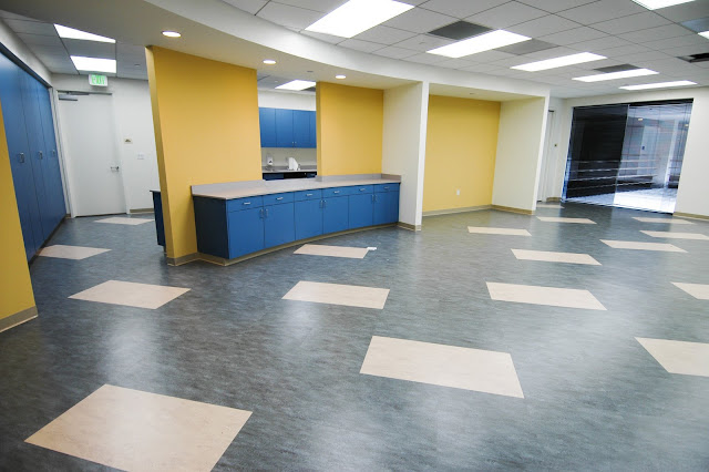
This buoyantly designed and cheerfully sustainable financial institution is not taking it lying down. Not for them the doom and gloom of bottoms falling out of markets, the dollar devaluing and plunging real estate. 


Lobby Reception with Art Inspiration


Cafeteria with Marmoleum Floor


Stairwell with Glass Bricks and Sustainable Carpeting


In this remodel, I used cheerful and natural colors throughout, I created beautiful translucent walls, and invited mother nature inside to peek over the shoulders of those keepers of the Dow Jones. 

I worked as the designer for Hagman Associates Architecture to choose sustainable carpeting from Shaw, Linoleum from Forbo Marmoleum, and wall coverings from Knoll Textiles throughout the 31,000 s.f. space. I designed the translucent walls and panels using sustainable resin from 3-Form and reclaimable metals by DIRTT wall systems for the San Jose, California administrative offices. 

Design inspiration was a large,  brightly colored and energetic painting used for corporate branding. This vibrant painting inspired the colors used in defining work spaces, and allowed us to tone down several areas to more natural colors and elements.


3-Form Resin Pattern:  Fossil Leaf Large


65 ft. Demountable Wall made from 
3-Form Resin Panels


Lobby With Arcadia Chairs with 
Mohair and Leather


Cubicles With Vibrant Color Accents


3-Form Resin Panels: 
 Hydrangea Thatch and Solo


We are betting the optimism grows and spreads, all the way to Wall Street!


09 February 2009

Three Color Trends 2009...Who's to Say?

I mean, really. Here are the color trends for interiors put forth by our friends at Benjamin Moore Paints. They derived these palettes from the larger studies by The Color Institute. I'd love to know what you think:


first palette:  Nature's Essence
The basics of nature at its roots...giving a tonal story of whites and off whites, subtly accented with organic green and lichen grey. Keeping things simple in 2009 since our world is in such turmoil, do our homes have to be? Begin with chantilly lace, a very start white, very simple and pure. From there add a bit of grey sky, the soft browns of white sand, the sea haze for a water feeling and pale avocado for a dash of hope!


second palette:  Unexpected Synergy

Sophisticated use of complex colors, these are colors with a darkened undercurrent that makes them warm, deep and rich. These are "liveable" colors for our times giving people a sense of peace, of security and safety. No bright Chinese reds here! We are all staying home a little more these days, and these colors envelope people and hold them close. 


third palette: Personal Imprint

On the other hand, people are also making "billboards" of themselves today. Tattoos. Green hair. Thrift store wardrobe. Individual expressions of belonging to a group. That's what these colors are all about. Unexpected combinations and throwing in colors to change the entire feel. Green is still here, even the young will not let go of the optimism of green. And not just any old black will do with this crowd:  it must be very high gloss and reflective. 

Then there's you and me. What do you think of these colors? Would you use them in your rooms? How do they make you feel?

If you did your own color palette of six colors, what would they be? Do you know why?

04 February 2009

The Obamas' New Designer is a Very Cool Guy

photo taken with my iPhone, sorry!

I, and a few dozen others, had a conversation with Michael Smith today, and now I want to be his best friend. He's just that kind of a guy.  He, however, lists Dustin Hoffman, Steven Spielberg, Rupert Murdoch as clients. He leads with his creativity and if the client doesn't go for it, he shrugs "hey, it's their house!"

He also loves Chinese wallpaper, murals, pays homage to France, to classical design. He suddenly loves flowers. He's not quite sure how he comes up with fusion concepts like "shogun modern" for a kitchen, or "loft living in the 16th Century" for a dwelling in LA. But he makes it work. 

When asked what is the next big design trend, he say that there isn't one. He says that now it is time to do what you can with what you have. To mix in high and low. To not be so very fashionable, to not always hit it right on the nose.  How incredibly refreshing?

For now, it looks like I have to share my new best friend with his latest clients: Barack and Michelle, Sasha and Malia Obama. 

And, this client does not have a very big budget. Seriously. 

He is going to make do, and rummage around that hidden warehouse outside of DC, to use and repurpose stuff already there. Could a designer ask for any more fun on this planet?


Michael Smith's new book, lovely to look at, lovely to read

03 February 2009

Back to My Living Room: Color + Fabric


citron media cabinet and coral mohair sofa

I am "backing into" designing my living room, because I found the mohair of my dreams at a great price. So the coral mohair is  driving the design around which everything else in the living room will be chosen. 

I chose the citron media cabinet as a complimentary color for the coral, and to inject a modern/luxe feeling to the fusty old room. I also found fabulous fabric in lemongrass for the windows. 

Next: choose fabrics for pillows + ottoman + small chair. This fabric will be used sparingly, so I want to really give it a punch. 


drapery fabric               new upholstery fabric?
lemongrass trevira for windows and a paisly I found

I love this trevira cs fabric, on the left above, for the windows. It is an amazing color! I loved it even before Michele Obama wore it on Inauguration Day. It's a synthetic, but looks and feels like silk. It's even washable, and is used for commercial spaces, which means it should wear well in my hard-used living room.  And it, too, is flame resistant. 

So now to choose another fabric to use for pillows, a small chair, an ottoman. I kind of like the paisley above right, but decided against it because the background has too much yellow, and the fabric, almost a taffeta,  was a little too dressy for this room.


        drapery fabric               another choice for upholstery?
the trevira with a coarser flowered fabric

This fabric above right intrigued me because I love large florals and the colors sing! It priced way too high for my budget, however, and I did have some reservations about the loose, linen-y weave. Ollie, my dog, would have it in shreds in no time.  And it looked a bit too granola for me. 


drapery fabric                I chose this one!
the windows fabric and the perfect complement

Finally, I found it. The perfect balance between colors coral and citron, and in an overall modern floral pattern that is vibrant and energizing! It is also a very tightly woven jacquard fabric, with a bit of sheen, so it will wear perfectly, and will add just the right amount of glamour to the room. 

What do you think?

LinkWithin

Related Posts with Thumbnails